Is there a universal recipe for promotional success? Probably not, but there are five simple rules that are worth following when designing a promotional notebook from scratch. Discover the five universal guidelines that you can employ when working on a Mindnotes notebook for your brand!
Strategic thinking first
Before you get down to drawing and working on your design, your point of departure should be to ask the right questions and find the correct answers. What questions could these be? First and foremost: for whom am I making this notebook? What function will it serve and what message should it convey? These are important questions, since they immediately define the course of the further design work. There are different goals when designing a strictly promotional notebook. Different circumstances dictate the look of a limited product that is gifted to your most loyal clients or contractors. Thinking for a while about the answers lets you save many hours of work! The answers to the strategic questions make it possible to maintain greater confidence when commencing design work and applying the rules listed below.
1. Size does matter
This is actually true when designing a notebook. A pocket-sized format is practical and can easily fit inside a bag or handbag. The A4 format makes for a typical office notebook that looks good on every desk. Picking a non-standard format will immediately draw attention. These decisions are followed by further choices, such as the number of pages or the type of paper, which determine the physical shape of your notebook!
2. Four sides of the cover
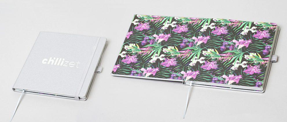
It’s worth remembering that a notebook is “dressed” in a cover on all sides. Its internal part, the endpaper, should correspond to the external cover (contrast with or complement it). Therefore, if you choose a minimalist cover, you can afford to do something more involved with the endpaper design. When designing the cover, it’s also a good practice to choose between dedicated typography and photography. Distinctive images need more breathing space to shine, so it’s worth exercising restraint when using letters.

3. Use the colour wheel
How to choose the colour scheme? It’s a broad subject, but there’s a tried and trusted method for it. Use the colour wheel and pick one of the many approaches to colour selection: monochromatic (several shades of the same colour), complementary (colours at the opposite sides of the wheel) or analogous (combining neighbouring colours in the wheel). While at it, you also shouldn’t forget about the meanings and psychology of colour (red – energy, green – calm, blue – confidence, etc.).

4. Design to print
Don’t forget the materials! When designing the notebook, you should be aware that whatever you draw will end up on the selected material and will be printed with specific ink by an individual machine. This looks like a limitation only on paper, for when you know the characteristics of the material and work together with the print shop, you can use the potential of the materials to the fullest. Designs ill-adapted to technology are a classic case and a nightmare of beginner graphic designers worldwide!
5. The devil is in the details
Remember about the details that can complement or completely ruin a design. A notebook encompasses accessories, a customised block and additional pages that you can use with imagination to create an aesthetically and conceptually coherent design! Non-standard solutions inside the notebook, such as agenda, dots or logos on each page, are just some of the many possibilities. The inside of a notebook can be surprising!

Before you begin designing, you should get to know the materials, the production capabilities, the print refinement techniques and the selection of accessories. Use the full potential for production and design an unforgettable notebook!

